
Built around
understanding.
A clear, expressive identity for an information and entertainment brand. The content leads. The identity makes it recognizable.

Make technology make sense.
One word. Drawn as one family.
The lowercase wordmark uses geometric letterforms drawn in SVG. Repeated curves and consistent stroke weight tie the name together. Tall ascenders give the silhouette its rhythm; open e forms keep it approachable.
The wordmark is entirely vector geometry. It contains no text elements, font dependencies, or gradients. The orange full stop is part of the signature: easabode. Keep the letters in ink or paper and the dot in Signal orange (#F15B3E), matching the website accent.
The compact mark uses the same e geometry. Use it for profile images and favicons, with the complete wordmark in the profile name or bio.
 Profile → small icon
These are proposed identity assets. Distinctiveness and trademark clearance have not been established. At favicon sizes, inspect the browser rendering; use the e alone if the tile becomes too small.
Mostly quiet. Occasionally unmistakable.
Paper and ink provide the structure. Signal is reserved for a lead story, a profile image, or one important highlight. Secondary colors distinguish editorial illustrations rather than competing for attention.
Use ink text on orange and pale backgrounds. Use paper text on ink. The website uses a darker orange (#C3432A) for the large headline; avoid small orange text on paper without a contrast check. Status always includes a text label.
Get to the useful part.
Typography
Plus Jakarta Sans leads the website, with Arial as fallback. Use medium and semibold weights for headlines, regular for explanations, and restrained italic serif accents for conversational quotes. The logo remains independent of these fonts.
Wide desktop headline: up to 86 px. Mobile headline: 40–64 px. Article body: 14–16 px with generous line spacing. Keep captions secondary and never hide important information in small labels.
Navigation
Guides → understand a topic.
Resources → get a practical download.
Experiments → follow a possibility.
Start here → choose a route.
Search and topic filters belong above the library. Titles should tell the visitor what they will learn. Every resource names its format and contains a real file.
A recognizable series.
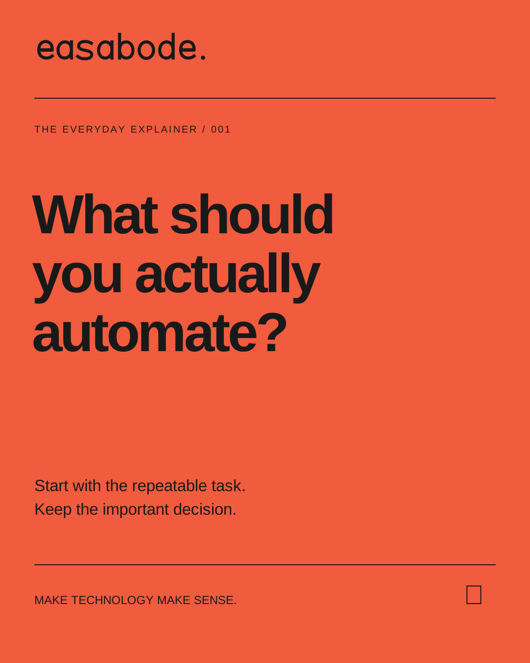
Carousel cover / 1080 × 1350. A clear question, one dominant color, a consistent wordmark. Editable SVG geometry and text.

Banner composition / 1600 × 600. Adapt the layout and check crops for each platform.
SeriesThe Everyday Explainer / The Useful Guide / The Everyday Experiment
BioMaking sense of everyday AI & automation. Clear guides. Useful resources. Honest experiments. ↓ Find your next useful idea.
VoiceCurious and observant. Start with a familiar frustration. Explain the idea simply. Make the next step obvious.
A few useful rules.
Space and scaleKeep at least one letter-height of clearspace around the wordmark. Proposed digital minimum: 130 px wide. The compact mark starts at 24 px; inspect actual rendering.
Logo integrityUse the supplied geometry with the orange full stop. Keep its proportions. On an orange background, use a single-color version so the full stop remains visible. Do not add glows, gradients, shadows, extra nodes, or a house around it.
Editorial honestyDistinguish a concept from a researched explanation or documented test. No implied device ownership, verified savings, or working integration without evidence.
MotionUse motion to explain relationships. Never make a long animation the only route to content. Mobile and reduced-motion layouts show the same information as normal cards.
ImageryUse real demonstrations and original diagrams that clarify the subject. Keep generic AI symbols and decorative interfaces out of explanations.
Before launchReview the logo at practical sizes, check symbol/name rights, finalize channel crops, and review the introductory articles. This is a local preview, not a published content catalog.